The top 5 web design tools for beginners are:
- Snapps.ai
- Wix
- Squarespace
- Weebly
- Figma
Web design tools help beginners build good, mobile, SEO-friendly sites. For instance, website builders provide pre-built components, user-friendly interfaces, and time-saving features. For those new to web design, these tools serve as a helpful guide. Other web design tools also let beginners focus on UI/UX, responsive design, and SEO.
Additionally, they help beginners design websites without needing to master complex coding. These tools simplify building sites that provide a great user experience. They work for both front-end development, CMS customization, e-commerce, and more.
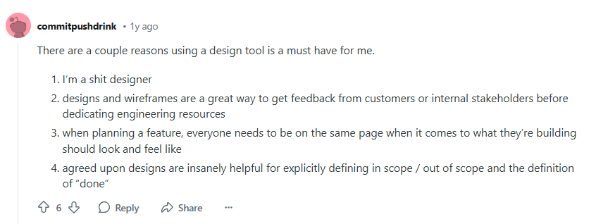
A Reddit user stressed the importance of design tools. They admitted their design skills aren't perfect. Tools can help fill those gaps. Designs and wireframes are crucial for getting early feedback from clients or stakeholders. This feedback can save time and effort in development. A clear visual plan helps everyone understand how the feature should look and work. Finalized designs also clarify what's included in the project scope. This clarity aids in deciding when a feature is complete.
In this guide, we listed the top 13 web designing tools for beginners that suit different skill levels. These tools help bring your ideas to life and build a strong foundation in web design.
1. Snapps.ai
Snapps.ai is an AI platform that simplifies creating web and mobile apps. It offers a no-code environment, enabling users to build apps quickly with a visual interface. The platform is for businesses, startups, and non-technical users. It helps them turn their ideas into digital products. It provides templates for eCommerce, productivity, and community platforms. Moreover, Snapps.ai easily integrates with popular services. This feature improves its functionality. It lets users automate workflows and build scalable, no-code solutions.
Cost:
$19 per month Single Site Pack; $79 per month Starter Pack; $159 per month Decade Pack
2. Wix
Wix is a user-friendly platform for creating websites with drag-and-drop tools. It offers templates for various sectors, including small businesses and blogs. Users may choose between free and paid plans. Wix also supports numerous apps, expanding its basic features. For web designers, it simplifies building attractive, functional sites, thanks to its design and support.
Cost: Paid plans start at $16/month, free plan available.
3. Squarespace
Squarespace is known for its clean and modern design templates. It appeals to users who prefer a sleek and professional look. The platform provides a seamless experience with a responsive design, which makes it compatible with any device.
Squarespace offers an array of templates suitable for businesses, artists, and bloggers. It integrates well with e-commerce features, allowing users to sell products effortlessly. Squarespace has superior built-in analytics, which helps users understand their audience better. This is an important aspect of developing effective marketing strategies.
Cost:
14-day free trial; plans start at $16/month
4. Weebly
Weebly is designed for simplicity, which makes it ideal for beginners. Its drag-and-drop editor is intuitive, allowing users to build websites even without a tech background. The platform supports both free and paid plans. Weebly offers basic SEO tools, e-commerce integration, and the ability to use custom domains. These features empower users to create professional websites that meet their specific needs.
Cost: Free plan available; paid plans start at $6/month
5. Figma
Figma is a cloud-based design and prototyping tool. It allows multiple designers to work on the same project simultaneously. It's an excellent tool for team-based web design projects.
Designers may create interactive prototypes of websites. It allows them to test user flows and interactions before development begins. Figma supports the creation and management of design systems. It ensures consistency across web projects.
Cost: The Professional package starts at $12 monthly, and Organization package is $45 monthly. Figma also has a free version.
6. Google Search Console
Google Search Console is vital for improving websites. It finds errors, enhances Google Search performance, and reveals how search engines view a site. The interface is simple, showing clicks, views, and rankings. Web designers can ensure proper crawling and indexing with it. They can also adjust designs to better user experience and accessibility.
Cost: Free
7. Google Analytics
Google Analytics provides invaluable insights into user interaction and behavior on a site. It allows web designers to track visitor demographics, bounce rates, and conversion metrics. Dashboards and reports are easy to read and customizable. So, designers can see how well their interface drives user engagement.
Cost:
Google Analytics 4 (GA4) is free for most users; Google Analytics 360 (enterprise version) starts at $150,000 per year
8. SEMrush
SEMrush is a powerful tool for keyword research and competitor analysis. It gives comprehensive data to web designers to help them create SEO-friendly content. SEMrush helps designers analyze the competitor’s strategies. They gain insights into design tools and other features that enhance engagement.
By analyzing competitors' strategies, designers gain insights. They reveal design tools and features that improve visibility and engagement. SEMrush supports graphic designers in aligning creative elements with SEO best practices. It enhances the effectiveness of visually appealing templates
Cost:
Pro version is $139.95/month, Guru version is $249.95/month, and the Business version is $499.95/month
9. Bootstrap
Bootstrap is a popular front-end framework developed by Twitter for quickly creating responsive websites. It offers a comprehensive collection of pre-designed HTML, CSS, and JavaScript components, such as modals, buttons, and carousels. Users can customize these components by overriding the default styles with their own CSS. It allows the designers to be more flexible with the design.
Bootstrap's grid system is one of its standout features. It lets designers organize the content into rows and columns. It automatically adjusts based on the device size and orientation. This ensures websites function smoothly on desktops, tablets, and phones without extra coding. Bootstrap integrates well with WordPress. It can be used with other software like Adobe XD for design development. Users love that it’s accessible and easy to use. Its robust feature is an advantage for those learning responsive design.
Cost: Free and open-source
10. Foundation
Foundation is a powerful framework for responsive web design. It is known for being flexible and customizable. The foundation provides users with tools for creating unique and device-agnostic websites. Its code is lightweight, which allows faster loading times. This benefits performance-sensitive projects. Designers can utilize its Sass and CSS functionalities to refine styles. This also ensures that the sites maintain a consistent look across all devices.
Foundation supports integrations with Wix and GIMP for added design flexibility. However, it might have a steeper learning curve compared to other free design tools. The framework's comprehensive and versatile features let designers build professional websites without too much customization.
Cost: Free and open-source
11. WebAIM Color Contrast Checker
WebAIM Color Contrast Checker allows input of foreground and background colors via hex codes or color pickers. WebAIM provides WCAG 2.1 compliance results for AA and AAA levels. It has a color-blindness simulator that addresses color vision deficiencies.
Cost: Free
12. Colorable
Colorable allows users to input entire color palettes for accessibility checking. Colorable generates a matrix of all color combinations in one palette. It provides WCAG 2.1 compliance information for each combination and offers a unique "magic" feature. This tool is used by designers to create accessible color schemes.
Cost: Free
13. Adobe Color
Adobe Color is part of Adobe's Creative Cloud suite. Adobe Color provides color contrast checking alongside other color tools. It offers accessibility simulations for different color vision deficiencies. This tool integrates with other Adobe products for seamless workflow.
Cost: Free
Jeremy Mura Shares The Best Web Design Resources in 2024
- Dora AI:
Generates websites based on simple prompts, creating editable layouts with images and text.
- Reloom: Allows users to generate websites for Figma and Webflow quickly, including wireframes that can be copied and pasted.
- Tilebit:
A cheaper alternative to Reloom with customizable web components for Webflow.
- Flow Bas:
A component library for Webflow and Figma that includes both free and paid options.
- Lambook: A site for web and landing page design inspiration, categorized by types like portfolio or pricing pages.
- Godly.website: Gives design inspiration, specifically for tech and SaaS websites, and allows filtering by Web3, AI, and more.
- Mobin: Focused on app screen design inspiration, showcasing designs from major brands.
- Mesh Gradients: Offers downloadable gradient packs for design projects, available in AI, PNG, and JPEG formats.
- Inspo Vault: A source for web design inspiration, including staff picks and trending websites.
- Navbar.gallery: Specializes in navbars, search bars, and complex dropdown designs for websites.
- Storytale.io: Provides 3D assets, illustrations, and mockups for designers, with both free and paid options.
- Contrast Checker: Ensures that website designs meet accessibility standards by testing color contrasts.
Methods For Building Responsive Websites
- Fluid Grids:
These use relative units like percentages instead of fixed pixels. This allows layout elements to resize dynamically based on screen size.
- Flexible Images and Media: Images and other media are set to scale within their containing elements. It typically uses a max-width of 100%. This prevents elements from overflowing on smaller screens.
- CSS Media Queries: It lets designers apply different styles based on device characteristics.
- Mobile-First Design: This approach involves designing for mobile devices first, then progressively enhancing for larger screens. It prioritizes content and performance for mobile users.
- Responsive Typography: This involves using relative units (em, rem) and techniques like fluid typography to scale text across different screen sizes.
- Breakpoints:
These are the points at which your site's content responds to provide the user with the best possible layout. The common breakpoints are 320px, 768px, and 1024px.
- Viewport Meta Tag:
This tag ensures proper rendering on mobile devices.
- CSS Flexbox: It is a layout model that allows responsive elements within a container to be arranged depending on screen size.
- CSS Grid: A two-dimensional layout system for the web that allows designers to lay out content in rows and columns.
- Progressive Enhancement: It starts with a baseline of usable functionality. And then, advanced functionality is added if the browser supports it.
Testing Tools for Optimization
- Google PageSpeed Insights:
This tool analyzes both mobile and desktop versions of a page. It rates the website’s performance out of 100 and gives recommendations for improvement. Google PageSpeed Insights integrates with Core Web Vitals metrics.
- GTmetrix: It provides detailed performance reports. GTmetrix gives performance scores based on Google Lighthouse and its own criteria. This tool allows testing from multiple global locations. It also provides a video analysis of page loading.
- WebPageTest: It tests from multiple locations and browsers. WebPageTests provide a detailed waterfall chart of page loading. It has advanced features like multi-step transactions and content blocking.
- Lighthouse:
This tool is built into Chrome DevTools. It audits the website’s performance, accessibility, SEO, and best practices. You may run from a command line or as a Node module. Lighthouse provides actionable recommendations for improvements.
- Chrome DevTools: It offers a comprehensive suite of web developer tools. Chrome DevTools has a network panel for analyzing request timing and size. The tool has a performance panel for in-depth performance analysis. It allows throttling to simulate various network conditions.
- Pingdom: This optimization tool has a simple interface for quick performance checks. It offers performance recommendations and lets you choose test locations. Pingdom also gives a breakdown of page elements.
- YSlow: It is a browser extension that grades web pages based on Yahoo's rules for high-performance websites. This tool gives suggestions on how to improve website performance. It is integrated with other tools like Firebug.
- Dareboost: This tool offers comprehensive web performance and quality reports. It has a side-by-side comparison feature and offers continuous monitoring and alerts.
- Cloudflare Speed Test: It tests for CDN performance. This tool gives detailed connections and downloads statistics. It also offers insights on how Cloudflare improve the site’s performance.
- KeyCDN Website Speed Test: This tool gives you timing metrics, a waterfall chart, and a resource list.
Agency Owner Rob O’Rourke Shares How To Build a Web Design Business
Maximizing Success with the Right Web Design Tools
Choosing the right web design tools set the foundation for a successful online presence. With these 17 tools, beginners easily learn the ropes, while experienced designers streamline their workflow and improve efficiency.
One tool that stands out for both beginners and pros is
Snapps.ai. It's a simple yet powerful website builder, offering flexibility and ease of use. Beginners will appreciate its drag-and-drop features, while experts take advantage of its advanced customization options. Whether you're designing for personal projects, web design clients, or want to grow a web design business, Snapps.ai offers a solid solution.
As the digital industry grows, these tools, including Snapps.ai, help you build professional websites quickly, making your web design business more profitable and enjoyable.